Testing, Testing, 1-2-3
We put the new iPad — I mean, The New iPad — through its paces in the studio this morning. For what it's worth, what we thought: 1. 768x1024 magazine pages look no better or worse on the higher-resolution screen. For publishers, there's no penalty for continuing to produce pages at this resolution — they look just as good or bad on The New iPad as they do on the iPads 1 and 2.
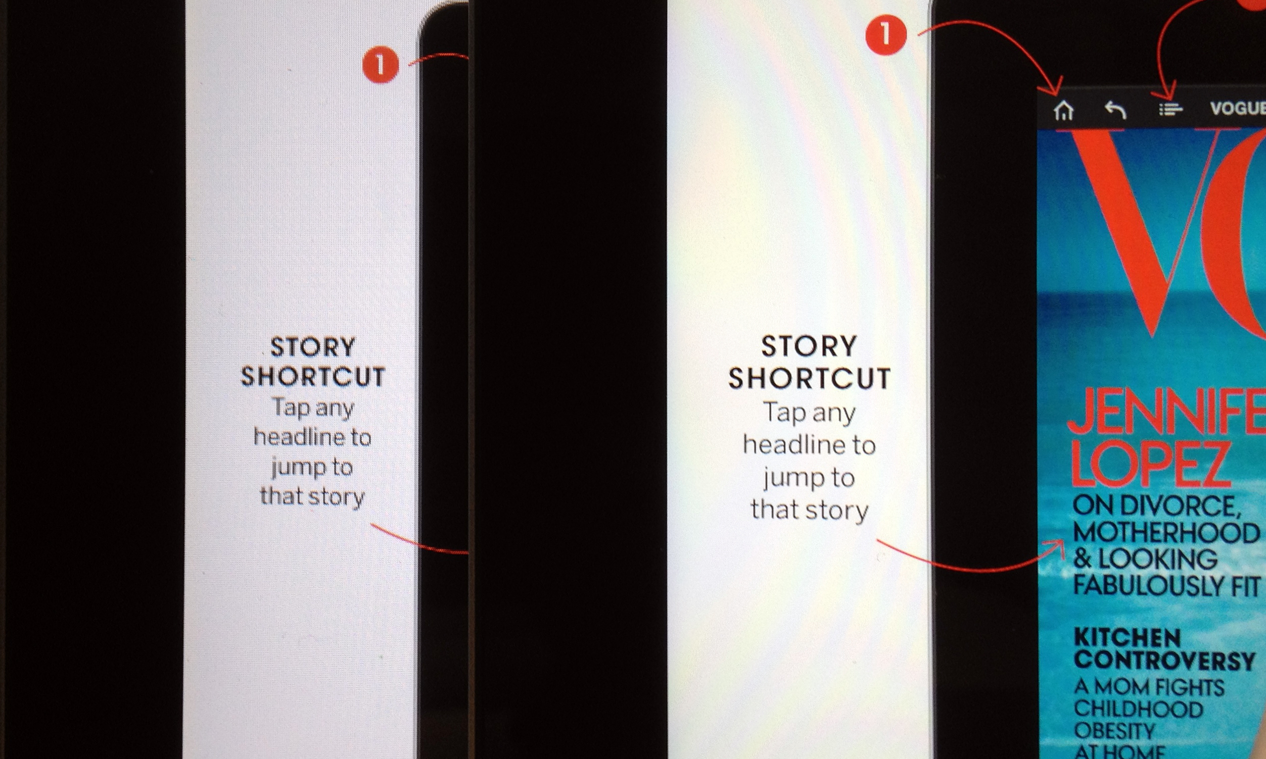
2. 1536 x 2048 magazine pages, such as the Vogue issue that came out yesterday, are significantly sharper on The New iPad than on the old. Whether the difference is worth the increased weight of the app is a strategic decision for publishers. The 768x1024 version was 277 megabytes. The 1536 x 2048 version was 412 megabytes. Adobe Digital Publishing Suite allows you to publish both resolutions, and the proper issue is downloaded to the proper devices automatically. Pretty slick. What isn't slick is that the publisher needs to render each edition twice, at the higher and lower resolutions, complicating the workflow.
The unretouched image below shows two renditions of the Vogue app. The device on the left is the iPad 2. The device on the right is The New iPad.
3. The bigger difference between one iPad and another was not resolution but color cast. The iPad 2s in our office are all much whiter than the two The New iPads we tested. Both The New iPads had a distinct yellow cast that made the overall viewing experience less pleasurable. For all we know, they'll cool down once they've been used more, or once their temperature changes. The image at the top of this post shows our Fast Company launch on the iPad 1, 2 and The New iPad. The 2 seems brightest, even though all are set at the maximum level. This was consistent among every iPad 2 in our studio.
4. We think Apple should just call The New iPad the iPad 3 already! :-)

