
One Size Fits Small, Like It or Not
An iPad mini that is fully compatible with all 275,000 iPad apps in the App Store poses a challenge for designers and developers. Until today, an iPad-only strategy allowed publishers to target a single device, the original iPad. Now they're suddenly confronted with the need to deliver that same content on a smaller model as well. There doesn't appear to be an option to restrict content to one device or another. Apps work interchangeably on both models, squeezing 1,024 x 768 pixels into a 7.9-inch display and stretching those very same pixels across a significantly larger 9.7-inch display.
Steve Jobs himself was quoted in October 2010 as saying that a 7-inch tablet was too small. "There are clear limits of how close you can physically place elements on a touch screen before users cannot reliably tap, flick or pinch them. This is one of the key reasons we think the 10-inch screen size is the minimum size required to create great tablet apps."
Many publishers sided with Jobs and sidestepped the smaller Android tablets. Those who did target the Kindle Fire, Google Nexus 7 or Samsung Galaxy Tab generally did so with a reformatted edition that simplified pages, adjusted point sizes and modified column widths to better fit the smaller screen. Those who simply republished content originally designed for larger tablets generally received criticism for type that was hard to read.
Now iPad developers have no choice but to design once for both screens, it seems. An iPad is an iPad, regardless of the form factor.
So what now?
Adobe provides a way for publishers to target specific screen sizes through what it calls "renditions." Adobe detects the screen size of a tablet or phone that requests content from its distribution servers, and then delivers the rendition that best matches that screen size, assuming that rendition exists in the first place. That way iPad 1s and 2s can access 1,024-by-768 renditions but not 2,048-by-1,536 renditions, which are larger and slower on these older devices. But creating two renditions caused more work for publishers, forcing Adobe to come up with a streamlined workflow that yielded a single 1,024-by-768 rendition with type sharp enough for both Retina and non-Retina displays.
It doesn't appear that renditioning is an option, however. Apple's marketing of the iPad mini is clear: One size fits all. "The App Store is home to over 275,000 iPad apps and counting. And right from the start, they work on iPad mini." It seems unlikely that Apple would approve an app that is restricted to just one model, but then again, nobody knows for sure. Until then, it's up to designers to choose type sizes and column widths that accommodate both devices, not just 10-inch iPads.
That's a significant departure from current workflows. Just this week, Joe Zeff Design is putting the finishing touches on apps for the iPhone, Kindle Fire HD and iPad. Each requires a separate approach to make content accessible for that device. It’s not only hardware and software driving those decisions, but differences in how people use phones, small tablets and large tablets.
Key dates ahead:
• November 2 may be the first time many publishers see firsthand how their digital publications play out on the iPad Mini, when the first shipments land.
• December 25 will be critically important as well, providing answers as to whether consumers favor Apple's 7-inch tablet over less expensive competition from Amazon, Google, Microsoft and Barnes & Noble.
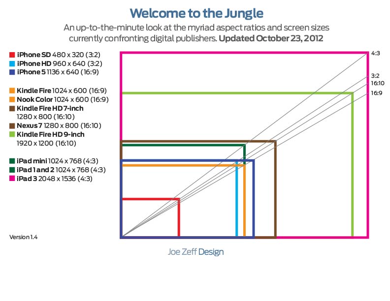
• By spring publishers should have enough data to decide: Is it worth producing separate layouts for iPad and Android tablets, or does it make more sense to produce a single set of 4:3 layouts that fit every iPad and use those same layouts with letterbox panels to fit the multitude of 16:9 and 16:10 Android tablets, as shown in our up-to-the-minute guide.
Stay tuned.